Monday, October 1, 2012
Design Principles and Font Principles
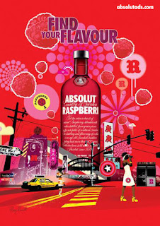
This ad has lots of contrast with its colors. The pink and purple shades are contrasting againts the background, also the yellow and black against the background and with each other. Things that are repeated in this ad are colors, texts, and elements of design such as a star emblem or an emblem with an R on it. The alignment for this ad is centered, the bottle is the main focus in the ad, and all of the details are offset around it. Proximity is shown in this ad by the tagline of this ad being place beside the bottle. In this ad the texts that are used contrast with each other, because they are two different types, one is a script text and one is a serif style text.
Subscribe to:
Post Comments (Atom)

No comments:
Post a Comment